Johnny B. is a professional-grade haircare brand that launched its first product — a pomade — nearly 30 years ago. Since then, their offering has expanded to include hair gels, beard oil, and other grooming products. But they’ve always remained committed to growing their brand in partnership with barbershops and salons, and have developed many of their products through the insights of hair professionals.
And they remained committed their professional product positioning; distributing their products directly through barbershops and salons. Pomades are the cornerstone of their professional line. And Johnny B. marketers know that shelf appeal matters: barbers and stylists need to feel proud of the products they recommend to their customers.
Packaging / Illustration & Lettering
The challenge
Design a distinctive, appealing box packaging for its pomade line to improve its shelf appeal and barber/stylist perception, boosting point-of-service unit sales, and building equity for the brand.
The other challenge:
In-House should pull off this redesign without modifying any of the packaging materials (the gray containers or the cube-shaped card boxes). We also needed to use the existing color palette and use the brand’s typeface and existing logo. The combined effect made for a dated looking product line.
Personal care packaging design can look vintage / classic, or very of the moment. Dated, though, is unlikely to drive sales.
Lucky for us, we love an impossible brief.
Insights
Our market research for competing and emerging brands and found that most pomades for men fell into one of four visual categories:
1. Upscale industrial –Dark colors and type in neutrals, chrome, brass.
2. Masculine nostalgia – Uses visual tropes for classically masculine spaces (complete with old-timey vibes): nautical, lumberjack/woodsman, army etc.
3. Rebel garagecore: mischievous car culture graphics and bold provocative messaging.
4. Laboratory luxury: sparse, all type on light backgrounds and premium pricing.
Johnny B. is one of a kind. It projects the confidence of those who know themselves, that don’t need to hide behind the graphics of “toughness”. They also aim to be accessible to all, while maintaining the highest quality standards. The positioning got the go-ahead, and with the constraints in mind, we got to work.
Design process
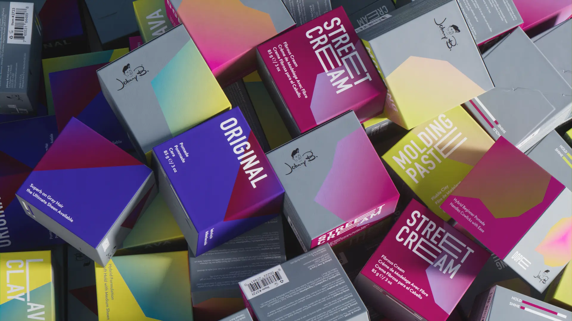
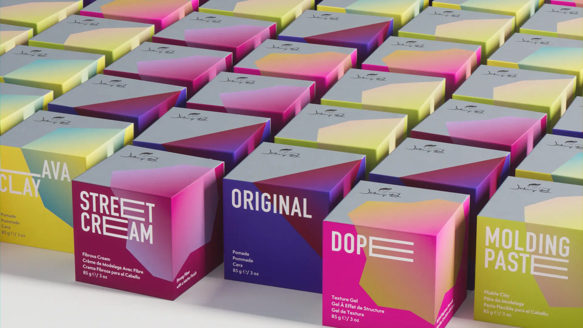
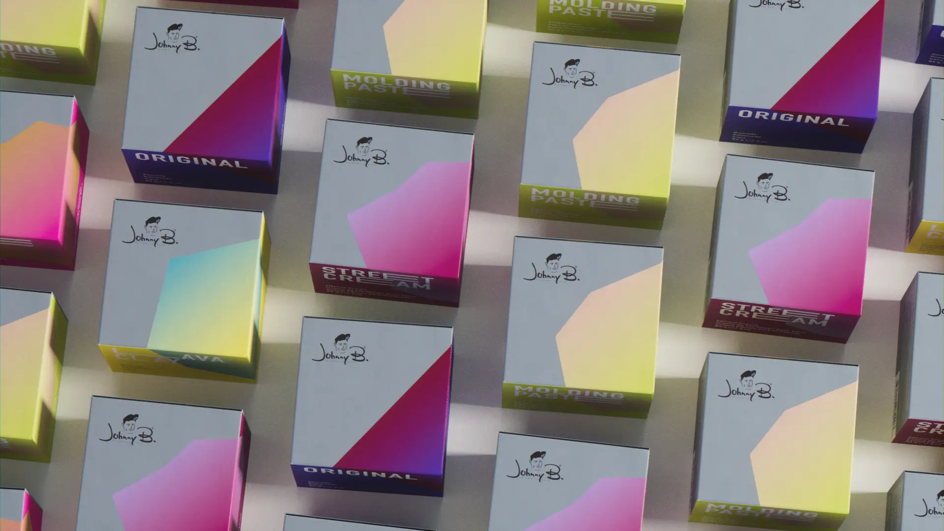
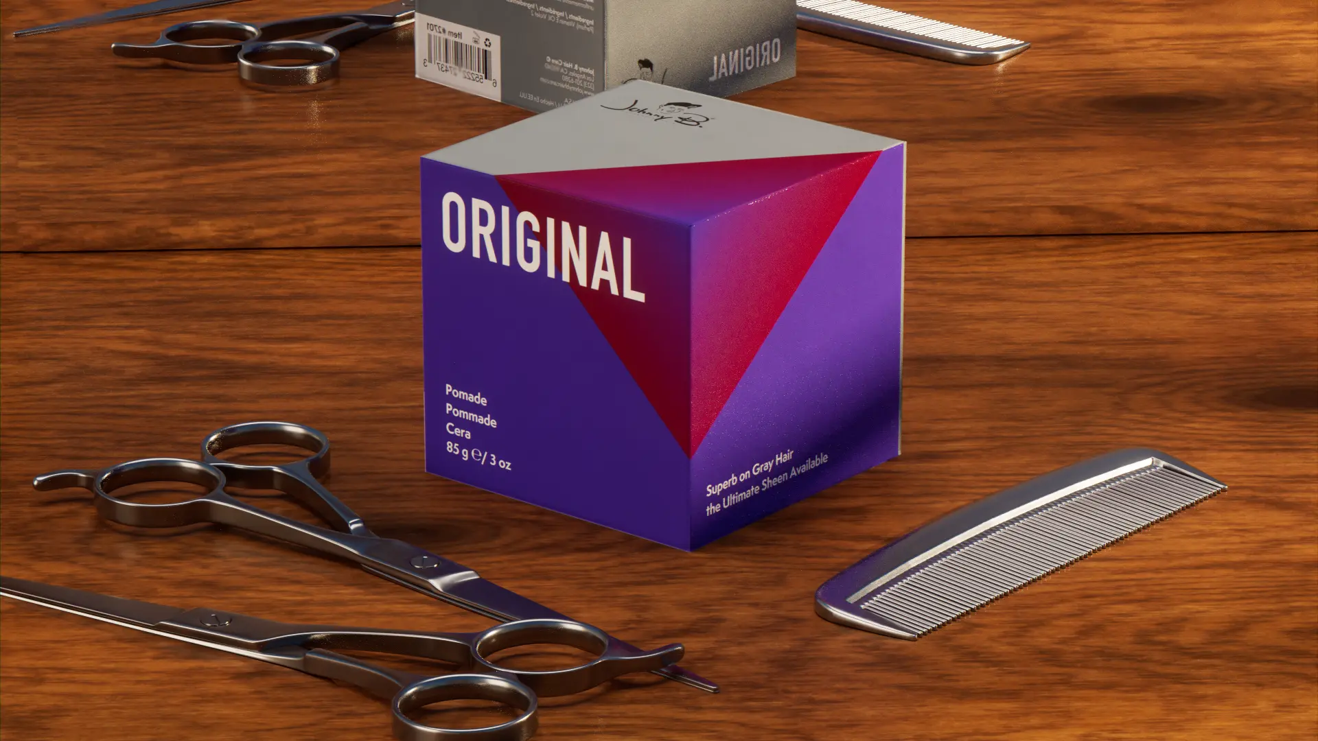
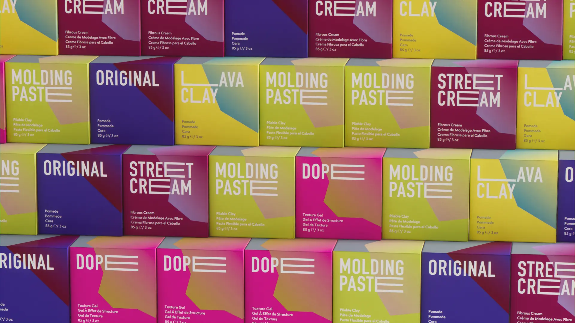
The first order of business was making the product line look cohesive.The color palette’s base color gray is a mid-tone cool hue, which didn’t harmonize with the individual accent colors for each of its five pomades. So we started by adding one hue to each color combination that would bring the set to feel… well, more like a set. We also focused on simple modifications for the typeface so it felt fresh.
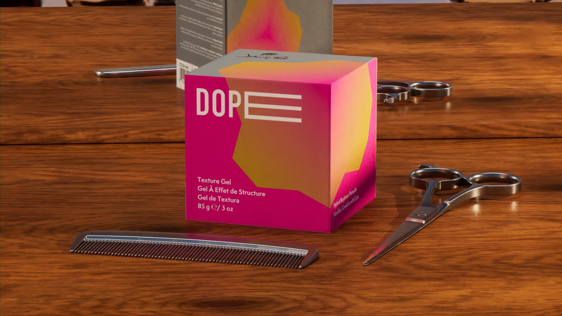
We then turned our attention to creating a system logic that helped tell each product apart in terms of function. The two main features varying across pomades are hold and shine (in that order). So we created a system of polygons that straddle three sides of the box, using the gradients to add dimension to the flat shape across three faces.
Polygons on each product roughly indicate the level of hold–from straight lines forming a triangle for Original, to a single point on each face of Lava Clay, and progressively adding points to the polygons to indicate definition.
We then mirrored the polygon from the box onto the plastic container lids, and applied the modified type to each system.
Results
The new product line hits all the notes: masculine but confident about color. Brand-derived but premium and professional feeling. Stands out as one of a kind. And is something barbers and stylists are proud to display and retail